Have You Ever Noticed the Hidden Smile in the Coca-Cola Logo? Look closely at the famous Coca-Cola lettering, especially the sweeping curve beneath the first letter “C.” Some people believe it looks like a hidden smile, with nearby curves appearing almost like eyes. Once someone points it out, it’s surprisingly difficult not to see it! But was this little detail deliberately designed into the logo?
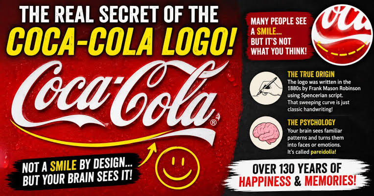
The truth is that the smile was not part of the original design. In 1886, Coca-Cola bookkeeper Frank Mason Robinson created the brand’s distinctive lettering using a flowing style inspired by Spencerian script, a popular form of American handwriting at the time. Its elegant loops and curves were intended to make the name stand out, not to create a hidden face.
Interestingly, the resemblance fits perfectly with Coca-Cola’s later marketing image. Over the years, the company used cheerful themes in campaigns such as “Open Happiness.” Some promotional designs even emphasized the smile-like curve, making the visual connection more noticeable. However, that doesn’t mean the original lettering secretly contained a smile.
👀 So why do so many people notice it today? There’s a psychological explanation called pareidolia, the tendency of our brains to recognize familiar patterns, especially faces and expressions, in ordinary shapes. That’s why we sometimes see faces in clouds, electrical sockets, or even the front of a car. Now look at the Coca-Cola logo again: can you see the hidden smile, or had you never noticed it before?